Nothing Phone 2a
MSRP $405.00

“The Nothing Phone 2a’s low price, fun design, colorful photos, strong performance, and masses of customization make it a brilliant buy.”
Pros
- Glyph Lights are fun
- Customizable software
- Bright screen
- Good speakers
- Colorful, social-friendly camera
Cons
- Confusing two-model lineup
- No wireless charging
- Battery life is only average
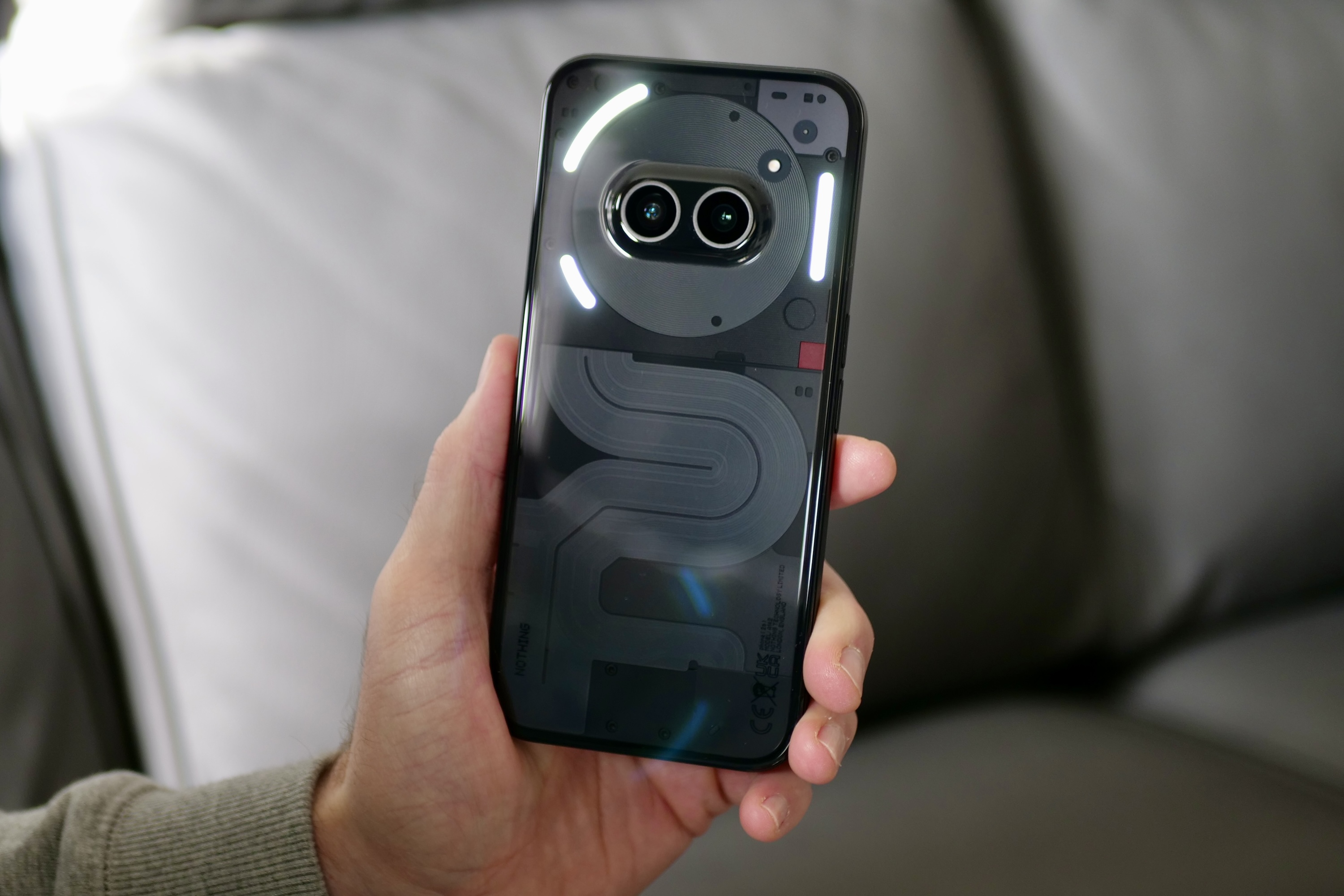
The Nothing Phone 2a is going to get a lot of attention. First for its design, then for the flashing Glyph lights on the back, and finally for the price. The look and lights will split opinion, but there’s no doubt that the phone has a really competitive price, and it’s all set to be talked about alongside other great value hardware.
Nothing has already successfully marketed the Phone 2a then, but is the phone itself a success worthy of attention? I’ve lived with it, and I’ll tease you with this: Get ready to have your expectations surpassed by this brilliant phone.
Nothing Phone 2a: design
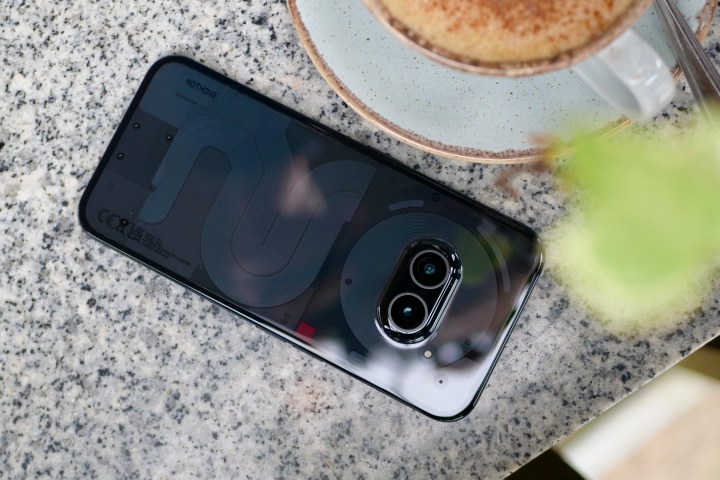
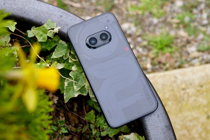
It’s fair to say that the Nothing Phone 2a’s design is controversial. The other day, Digital Trends staff writer Christine Romero-Chan said that due to the cameras on the back of the Nothing Phone 2a, the look reminded her of a pig’s snout, and now I can’t think of anything else. It’s certainly not a favorable comparison, but it’s not inaccurate if you look at it a certain way. Thankfully, the design is also reminiscent of a pair of eyes, and once you force the pig comparison out of your mind, it makes the new phone appear considerably cuter.
I’ve been using the black version, but there’s also an attractive “Milk” version available, which has an off-white color scheme. The back follows Nothing’s established love of transparency, but as the phone does not have wireless charging, the visible components are simpler than on the Nothing Phone 2, and the phone has a slightly less sci-fi look.

The surfaces are warm to the touch and at 190 grams and 8.5mm thick, it’s easily pocketed and manageable with one hand. The IP54 water and dust resistance is also welcome. The rear cover and chassis are polycarbonate, but the rear attracts a lot of fingerprints. Does this mean it feels cheap? The chassis has a pleasing, grippy texture and a metal-like finish, but the polycarbonate rear panel does have a hollow, obviously plastic sound when you tap it. I’d call it representative of the price, if not a step above what some may expect.
The thing to understand is, it ends up not mattering if it feels expensive. Since the design is modern and unusual, it looks and feels different from anything else apart from the Nothing Phone 2. Exclusivity like this immediately makes the uninitiated assume it costs more than it actually does. However, you may have to work to keep it looking its best.
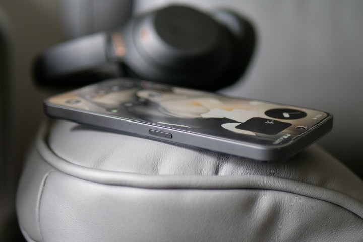
The phone is rather slippery, despite the stabilization provided by the camera bump, and it has slowly crept off many surfaces during my time with it. I’m a little concerned about the durability, as even though I’ve only used the phone for a short time, it has already picked up a small dent/nick on the side and a couple of scratches on the lower part of the screen. It has taken a few tumbles due to the slipperiness, but not onto any hard surfaces, making this a worry.
You’ll be proud to carry the Nothing Phone 2a around.
Nothing has made a distinctive and unusual-looking smartphone, just as expected from the design-led brand. And compared to almost all other phones available for a similar price, it really stands out. It’s a phone with character, particularly when you also consider the depth of customization in the software, and pig-comparisons aside, that makes it rather special. Provided the durability doesn’t prove to be an ongoing problem, you’ll be proud to carry the Nothing Phone 2a around.
Nothing Phone 2a: screen and performance
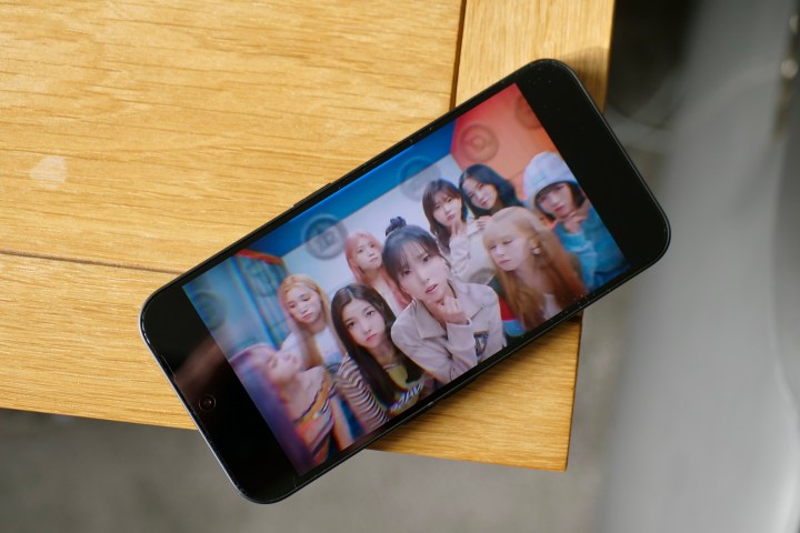
The Nothing Phone 2a has a 6.7-inch AMOLED screen with Gorilla Glass 5 over the top, a 30Hz to 120Hz refresh rate,and a maximum brightness of 1,300 nits. It’s a substantial upgrade over the Nothing Phone 1, and in some areas even better than the Nothing Phone 2 — it’s brighter under normal use and has thinner bezels — but the biggest hardware change is found inside the device.
It’s Nothing’s first phone with a MediaTek processor, the Dimensity 7200 Pro, which has been specially created by the two companies for this device. Built using a 4nm process, on paper, it’s a higher-performance chip than the Qualcomm Snapdragon 778G+ in the Nothing Phone 1, plus it’s backed up by 12GB of RAM. The Nothing Phone 2a also has Virtual RAM, with 2GB of internal storage set as RAM by default, but this is configurable up to 8GB.

Nothing has excelled with the screen, which is really bright and colorful, It’s matched with great stereo speakers. All this makes it a joy to watch video and to play games on it. During normal use — including apps, GPS, and general system navigation — the Nothing Phone 2a’s performance is faultless. It’s smooth and responsive, helped by Nothing’s slick software. I’ve lived with multiple phones since the beginning of the year, and for everyday use, the Nothing Phone 2a’s performance rivals devices that cost a lot more.
What about games? The slight curve of the rear panel and the flat sides make the Phone 2a comfortable to hold in landscape orientation, and playing Asphalt 9: Legends is fun and immersive, with no obvious slowdown or jitter. But do remember that if you push it hard with more graphically intensive games, it won’t perform like a flagship phone. Regarding efficiency, the 20-minute 3DMark Wild Life Stress Test, which didn’t generate much heat, reduced the battery life by only 5%, suggesting it should easily handle extended casual gaming sessions. Nothing’s decision to work with MediaTek to tune the processor, and its choice of screen, makes the Nothing Phone 2a a brilliant low-cost all-arounder.
Nothing Phone 2a: Glyph Lights
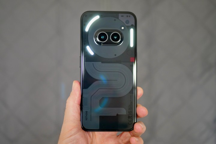
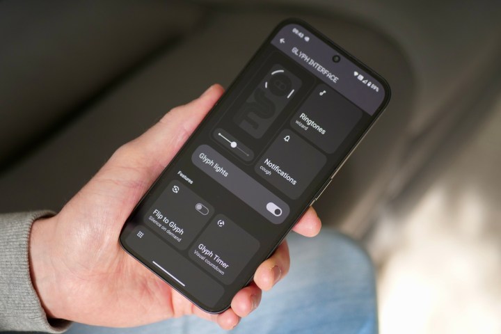
Just because the Nothing Phone 2a is Nothing’s cheapest phone doesn’t mean it’s forgoing the brand’s signature feature — the Glyph Lights. The light array on the back of the phone has been scaled down compared to the Nothing Phone 2, but it’s still fun, eye-catching, and effective at grabbing attention. There are three lights surrounding the camera module, which flash and pulsate when the phone rings or a notification comes in, while one light bar can also signify time remaining on a timer and the volume level too.
The Glyph integrates with Uber, Zomato, and your calendar to provide time-based alerts and syncs to music playing through your phone You don’t get the battery charge indicator, and the lights aren’t quite so intense or intricate as the Nothing Phone 2’s, but they still get the job done. I love the different ringtones and notification alerts, each with its own lighting sequence, and it’s possible to compose your own tones (if you’re musically inclined) using the built-in editor.

There’s no question about it: The Glyph Lights are fun, even if they are a tiny bit gimmicky sometimes. But if you want an endorsement about the Nothing Phone 2a’s extravagant sound and light show, how about this: The Phone 2a (and Phone 2) is one of the few phones on which I ever leave the sound up for alerts when I’m using it. I can take or leave the lights, as my phone is usually face up, but the unique sounds only add to the Nothing Phone 2a’s character.
Nothing Phone 2a: camera
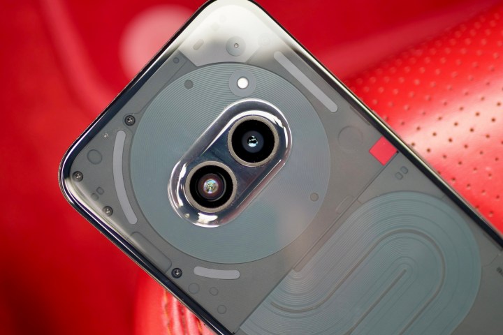
The two cameras hidden inside the pig’s snout (sorry, eyes) on the back of the Nothing Phone 2a are a 50-megapixel main camera and a 50MP wide-angle camera with optical image stabilization (OIS) and autofocus. There’s also a 32MP selfie camera just like on the Nothing Phone 2. The hardware has been upgraded over the Nothing Phone 1, plus the processor and image signal processor (ISP) are different due to the MediTek processor inside.
The Nothing Phone 2a’s camera is enjoyable to use.
Photos taken with the Nothing Phone 2a are vibrant, colorful, and exciting to look at, with amped-up saturation and strong HDR on display in most. If the full HDR look isn’t for you, the Phone 2a’s Ultra HDR feature can be turned off under the camera settings where it’s on by default, but don’t expect photos to be dull and lifeless afterward. In fact, I don’t think the Nothing Phone 2a can capture dull and lifeless images at all.
Anyone craving realism may not like the Phone 2a’s camera, but anyone wanting to share visually arresting photos online will likely love it. The good thing is, there’s still plenty of detail and texture in images, and it has no problem focusing when you get close to your subject. Selfies are also great, with lots of sharp detail and pleasing colors, and the portrait effect looks good, with accurate edge detection. Lowlight isn’t its strong point with a lack of color and sharpness, as well as a lot of blur when it gets very dark.
The Nothing Phone 2a’s camera is enjoyable to use, I’ve been confident in its ability, and there’s plenty of consistency between the main and wide-angle cameras. The disappointing lowlight performance is understandable at this price. However, outside of that and considering this is Nothing’s “cheap” phone, the camera doesn’t disappoint at all and is often as fun as the phone’s cool design.
Nothing Phone 2a: battery life
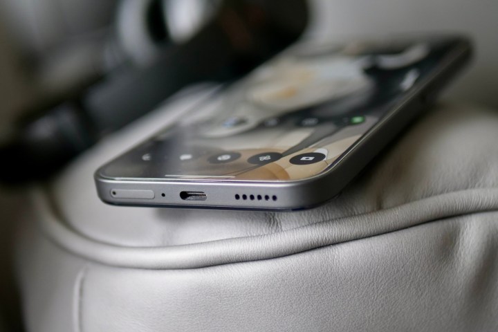
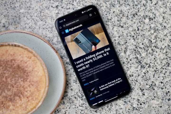
Hiding behind the transparent rear panel is a 5,000mAh battery, which is recharged using only a wired charger at a maximum of 45 watts. The Nothing Phone 2a does not have wireless charging, and it does not come with a charging block in the box. Nothing and MediaTek seem to have worked hard tuning the processor and software for sensible efficiency, without going overboard with power management techniques. The Phone 2a doesn’t aggressively adjust the screen’s brightness, there’s a proper always-on ambient mode on the lock screen, and apps seem to happily sit in the background until called into action.
The result is a battery that will last two days on a single charge with around three hours of screen time each day. Play games, and this does impact battery life a little more, but provided it’s around 30 to 45 minutes of play, the battery will still easily make it partway through the second day. Playing Asphalt 9: Legends for 30 minutes reduces the battery life by about 8%, while 30 minutes of YouTube streaming takes just 4%.

To charge the Nothing Phone 2a, I used the 45W Anker 313 charger and a compatible USB-C cable, and the phone took 25 minutes to reach 50% and was fully charged after an hour. It’s rare to find very fast charging on a phone at this price, but this is basically the same performance you get from the Nothing Phone 2, plus other devices like the Google Pixel 8a and the Samsung Galaxy A55. To get faster charging, take a look at the $500 OnePlus 12R, which takes less than 30 minutes to fill its larger 5,500mAh cell, or the OnePlus Nord 4.
I was hoping for a little more from the Nothing Phone 2a’s battery. It’s certainly not awful performance, and two days with average use will be fine for a lot of people. But given the modest power requirements and large capacity cell, I did expect to see it last even into a third day when I wasn’t pushing the phone hard.
Nothing Phone 2a: software
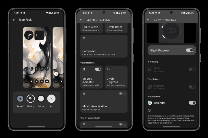
Android 14 with Nothing OS 2.5 is installed on the Nothing Phone 2a, and is the same software running on the Nothing Phone 2. It’s hugely customizable, from using a variety of special widgets created by Nothing to switching the app icons to a minimalist Nothing style. It’s somewhat successful, although if you’re used to recognizing app icons by color, it takes some adjustment. I like the AI wallpaper option where a full image is used on the lock screen and then blurred on the home screen, as well as the decision to not mess around with the notification shade or the app drawer.
It’s very easy to make Nothing OS look unique to you, and after a succession of using phones at a similar price without a true always-on screen, I’m very pleased I can see the time and notification icons on the Phone 2a’s lock screen all the time. But not everything is a success. For example, it’s far too easy to activate the floating window feature, and much too annoying to quickly get rid of it once it’s hanging around on the screen.
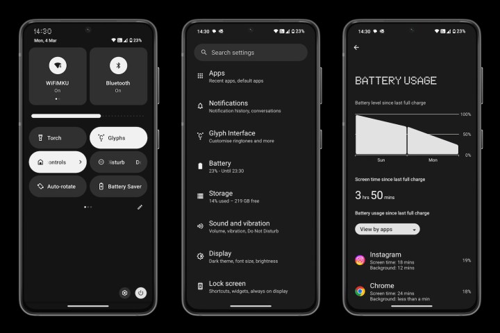
But for all Nothing’s talk of high levels of customization, widgets, and pixel art-style icon designs, the underlying software you actually use is close to the simplicity and logic found in Android on a Google Pixel 8, and it takes far less effort than Samsung’s One UI on the Galaxy A54 to set up and get comfortable with. The phone’s performance helps here, too, as it’s never slow, making life with the Nothing Phone 2a very easy.
Nothing provides three years of version updates and four years of security updates, which is less than Samsung and Google provide, but acceptable for a low-cost smartphone that many people will not plan to keep for so long anyway. I’ve used the Nothing Phone 2a with Wi-Fi, 4G, and 5G connections, and it has behaved perfectly, plus calls are clear for both parties.
Nothing Phone 2a: price and availability
The Nothing Phone 2a isn’t being widely released in the U.S., but there is a way to get one if you’re really motivated. It launched in the U.K. on March 12. The standard 8GB RAM/128GB storage Nothing Phone 2a costs 319 British pounds, or about $404, while the 12GB RAM/256GB storage model (which I have been testing) costs 349 pounds, or about $442.
Let’s put this into context. The Google Pixel 8a launched at 499 pounds ($499), the Samsung Galaxy A55 launched at 439 pounds ($550), and the OnePlus 12R is 650 pounds, or a bargain $500 in the U.S. All three are great smartphones, and although there are deals out there when comparing launch prices only, the Nothing Phone 2a’s value is clear.
There are some rivals at the cheaper end of the scale, too. The Samsung Galaxy A35 is $400 or 340 pounds and is a more sensible phone without the glitz of the Nothing devices. Plus, there are two more alternatives that come from Nothing itself. The first is the CMF by Nothing Phone 1, which costs just 200 pounds in the U.K. and is a real bargain if you don’t care about the Glyph Lights but still want some fun customization. The second needs a lot more discussion.
What about the Nothing Phone 2a Plus?

If you’re looking at the Nothing Phone 2a, you’re probably wondering if it’s worth buying the Nothing Phone 2a Plus instead. It’s an odd phone as it came out several months after the Phone 2a, but despite its name suggesting it may be bigger, it has the same dimensions and size screen as the Phone 2a. The overall look is almost identical, too, apart from a new color and a new look to the design under the transparent rear panel.
So what is new? It has a new processor, and it’s another exclusive chip made by MediaTek for the Phone 2a Plus. Nothing claims a 10% performance boost and that apps will open faster, while the new GPU is faster, too. The other major alteration is that the Nothing Phone 2a Plus has swapped the 32-megapixel selfie camera for a 50-megapixel selfie camera, but in a simple comparison, the differences between the photos are minimal. Aside from these (quite small) changes, that’s all there is.

After using the Nothing Phone 2a Plus for a short time, I didn’t immediately notice any difference in performance. Nothing says the phone has been made for “power users,” but I’d suggest that if you really want a faster phone for multi-tasking and longer gaming sessions, the Nothing Phone 2 would be the better purchase. Otherwise, look at models like the OnePlus 12R, which offers a substantial performance boost.
The Nothing Phone 2a Plus costs $399 or 399 pounds, and in the U.S., it’s only sold through the “Beta Program.” Nothing previously used a similar program for the Nothing Phone 1. The Nothing Phone 2a Plus is a very strange phone. If you want the Phone 2a, then the Phone 2a Plus only costs a little more but is slightly upgraded, so it’s probably worth buying instead of it. But if cost is the driving factor — as is likely for a phone like the 2a — then the regular Phone 2a is cheaper and basically the same. If you’re a bit confused, then I don’t blame you. The Nothing Phone 2a Plus does little but confuse the buying process, and it makes us wonder why it exists at all.
Nothing Phone 2a: verdict
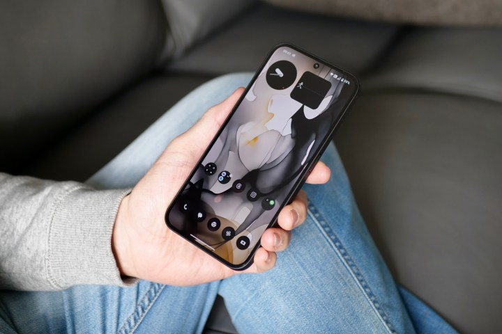
There’s something about cheap phones. They almost always have at least one significant downside, whether it’s a disappointing camera, terrible software, or an essential feature missing. Sometimes, it’s a combination of all this and more. We’re conditioned to expect less when paying less and usually gravitate toward a more expensive phone to avoid such annoyances. Amazingly, the Nothing Phone 2a seems to have avoided these pitfalls, and it may be one of the few cheap phones that isn’t severely hobbled in one or more crucial aspects.
As much as I like the Nothing Phone 2, the Nothing Phone 2a feels like the sweet spot.
Complaining there’s no wireless charging, only an IP54 rating, and that it doesn’t feel as good in the hand as a phone made from glass and metal misses the point. It’s at least half the price of phones with all this in their favor, and the fundamentals — software, performance, screen, sound, and camera — are all very well judged and work really well. What really tips it over into “must-have” territory is the unique and eye-catching design, both in terms of the hardware and the software. It doesn’t follow the crowd, and neither will you if you buy it.
As much as I like the Nothing Phone 2, the Nothing Phone 2a feels like the sweet spot. The competition can’t get close to it, while there are a lot of other great phones to choose from. Using the Nothing Phone 2a reminds me why I enjoyed spending time with the Google Pixel 7a. It works flawlessly, is honest in its ability, looks great, and delivers an excellent software and ownership experience without padding the price. Is it all the reasonably priced phone you need? Unless you’re a real power user or hardcore gamer (beyond who Nothing claims the Phone 2a Plus is for) or a very keen mobile photographer, there’s a good chance it is.
