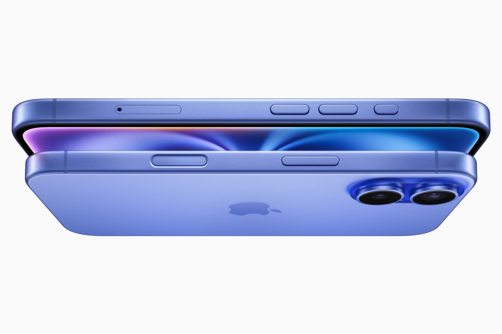
It’s funny to think the rumour mill for years banged on about how the iPhone would soon have no buttons. Now the iPhone 16 has acquired two new ones: the Action button from last year’s Pros and the fancy new Camera Control – which debuts across the entire line. This decision will doubtless make minimalism fans shriek with fury (in unison, using a solitary pitch-perfect note), but for everyone else it’s a boon.
Muscle memory is a good thing. And it’s been given a kicking in an era of smartphones. Yes, it’s lovely that your device can ‘become’ anything by way of an app. But when virtual buttons sit beneath a slippy pane of glass, that’s a problem when you’re not looking at the display and need to do something quickly. Like, for example, take a photo.
That action shouldn’t require you to think about what you’re doing. A dedicated hardware button you prod a couple of times beats tapping your phone, waiting for it to wake up, tap-holding a Lock Screen icon, moving your thumb to the camera button, and then looking beyond your blower to see the moment you wanted to capture has gone forever.
Right on the button


But hang on, you might say. Apple already has the Action button, and that’s now on every iPhone too. Job done. No need for a stupid new Camera Control button! And anyway, how many buttons do we need? Will you only be satisfied, Craig, when there are so many buttons that you’ll be able to blow into the mic and play your iPhone like a futuristic recorder? Eh? Eh? EH?
To which I’d say: steady on. And then follow up by noting that the Action button experience isn’t always stellar. A hold and a prod does indeed net you a snap in Apple’s Camera. But to use a third-party app, you must first gawp at Face ID and may again miss the moment – or end up shooting your 16th confused-face weird-angled selfie of the day.
Besides, Camera Control has all sorts of other gubbins packed into it. You can swipe and flick, to zoom, adjust exposure, and scoot through menus. Later this year, iPhone 16 Pro users will get a two-stage shutter with focus and exposure lock. The iPhone will finally feel like a real boy (camera).
Pushing somebody’s buttons


At which point, you might get grumpy again and argue that Camera Control whiffs of Touch Bar. Apple is again massively over-thinking and over-engineering something. We could have just had a button! A simple button! For simple people!
To which I’d suggest it’s not like (to my knowledge) Tim Cook teleports in each time you use Camera Control, tutting loudly over your shoulder when you don’t use its full functionality. If you want it to just be a button, it can just be a button. If you want to ignore it entirely, you can – it’s flush to the iPhone’s frame. But if you’re keen to use your iPhone as a better camera, this feels like the top iPhone headline from this week’s event.
Which is not to say there aren’t issues. In reality, what looks like flexibility might turn out to be fiddly. Third-party cases now look like someone’s angrily hacked a section away with an axe to accommodate the button. (It’s quite possible someone has.) And it remains to be seen how effective Camera Control is when you wear gloves.
For now, though, Apple is pushing all the right buttons. Even if there are more of them than you’d reasonably expect.
